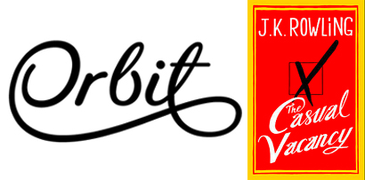
Right or wrong – or just a matter of taste?


I love typography and calligraphy, and hand-drawn type can add flair and vibrancy to a design. One of my favourite lettering artists is the very talented Seb Lester, who designed the Orbit logo shown above. If you want to feast your eyes on more of his work, you can check it out here. Although Seb’s work is very ‘free’, he follows the unwritten rules of typography, and ensures that proportion, spacing and flow are spot-on.
I don’t feel the same about the cover of the new JK Rowling book; the script is ugly, the relationship between the size of the capitals and lower-case is not pleasing, and the hand-drawn sans-serif lettering at the top is just plain wrong – it should be clean and crisp to create a contrast. Is it just me, or do you agree?


