

People think graphic design is all about making things look beautiful, but sometimes designers have to do the exact opposite. Can ugly colours affect sales? Let’s look at the packaging for Australian cigarettes. From October 2012, the Australian government decreed that cigarettes were not to be prominently displayed, and should all bear a uniform look – much to the horror of the branding and marketing executives at Tobacco companies. Marlboro even tried to (unsuccessfully) sue the government.
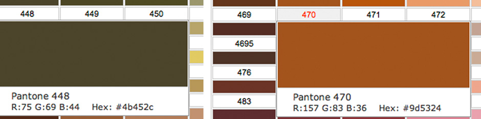
75% of the front of the packet had to be taken up with a health warning (including a shocking image), only 1 font could be used (Lucida Sans), and one colour: Pantone 448 Opaque Couche. This murky green/brown was found in tests to be the least appealing colour of the whole spectrum. Other colours considered were white, beige, dark grey, mustard, and lime green ( this surprised me as it’s one of my favourite colours, though not for a cigarette packet).
The fact that a shade of brown was chosen doesn’t surprise me at all – I don’t think I have ever used brown in any of my designs, and my heart sinks when clients tell me they like Autumn colours.
Is this worse?
Colour is very personal, and in my view: Pantone 470 is even worse. What do you think? Do browns signify an earthy warmness to you, or are you like the majority who find it off-putting?
Psychology behind the colour
Colour expert Karen Haller says: ‘In a nutshell, this specific green/brown hue communicates stagnation, decay, rot and ultimately death in its negative psychological traits.
‘What must be remembered here, we’re not looking at the colour in isolation, but in the context in which the colour is being used. By connecting smokers to the negative emotions of this colour, the aim is to use it as a buying deterrent.
‘Of course this won’t have the desired impact on everyone – colour doesn’t work that way, but the aim is to have this effect on the maximum number of tobacco consumers (and would be consumers) as possible.’*
Has it worked?
It’s now been 10 years since this change was made. The UK was second to introduce plain packaging, after Australia. It’s been a success here, with a sizeable reduction in the sale of cigarettes. At least 15 other countries have followed suit.
Silver lining
An unexpected outcome resulted from this design challenge: the original Australian packaging was nominated for a design award by the Design Museum in London (though sadly did not win).
*Quote with permission from Karen Haller from her article Is this really the world’s ugliest colour?
About the author
Annette Peppis leads the team at Peppis Designworks, a creative hub of established publishing industry experts who create books, branding, marketing material and design templates for leading publishers and businesses. Keep in touch by to her bi-monthly emails.


