Menu design: there's more to it than you think

‘Fresh, light and fun’ or ‘modern, yet traditional’? Both! Though not at the same time. This was part of my brief from the manager of the Lensbury when we discussed the design of his new menus.
The Lensbury
 For those not familiar with the Lensbury, it’s a beautiful hotel, conference centre and leisure club situated on the north bank of the Thames by Teddington Lock. It has a wide mix of customers: corporate clients who use the conference centre and hotel, guests who may be attending a function there and people from the local community who are members of the leisure club. The clientele ranges from young families to senior business figures of all ages and both sexes. How could the menu design cater for all those tastes (pardon the pun)?
Design briefing
Part of the problem was solved for me: the ‘All Day Menu’ would be available to everyone at all times, but a section of the restaurant (the Dunbar Room) would have a different, more sophisticated menu in the evening, more suited to the corporate clients.
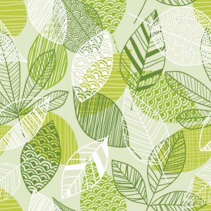
The Lensbury’s manager showed me a picture that his in-house designer had sourced for the All Day Menu which he liked, and also a menu design that he thought was on the right track. This was immensely helpful as I could gauge what he wanted from these. Also, the image was a good one, giving off the right ‘feel’ – which is not normally the case when I’m presented with pictures. He stressed that the design should be fresh, light and fun.
The Dunbar menu and separate wine list were to be altogether different, ‘modern, yet traditional’, and more upmarket. I had a free hand on the design. My only constraint was that they had to be the right size to fit into beautifully sleek dark-grey menu holders, and feature the (already designed) Dunbar logo.
Before starting work, I visited the restaurant, had a chat with the restaurant manager, and took some photos so that the menus would be in keeping with the newly refurbished surroundings.
The All Day menu
One of the first things I had to decide was the size of the menu. I’d been asked to squeeze the wine list onto it if possible, so it would have to be quite big. I settled on a 4-page A4 format. Looking at the copy on the Word document I was supplied with, I guessed that a 2-column format would make the best use of space, and roughed out the design on paper.
Using Adobe InDesign, I then set up the document and roughly placed the text in position to see if it fitted – it did, allowing me to use space generously (this is crucial to a good design). Once I knew what was going on which page, I could design the header, choose the typefaces and style the type. I did this with ‘style sheets’ so that if a global change was needed for any typographic element (dish title, description, price, etc) it would be easy for me to change.
Although the design was fresh and light (I’d used the greens from the primary image), it lacked fun and needed livening up – whilst still appealing to the more cultivated diners. I introduced a repeat leaf pattern at the foot of the inside pages, took individual leaves and used them as ‘watermarks’, and differentiated the children’s section by using a subtle background tint overlaid with a sprinkling of stars and party hats. You can see the finished design in my portfolio.
The Dunbar menu and wine list
I had a free hand for the design of these more upmarket items. My only constraint was that they had to be the right size to fit into beautiful menu holders. I chose Gill Sans as the main typeface, which is the Lensbury brand’s main font. Designed by Eric Gill in 1927, it’s classic, but to me still looks modern, and the capitals look wonderful when widely spaced. I decided on peachey-pink and pale grey to compliment both the menu covers and the restaurant surroundings and went about the design much as I did above. You can see the finished design in my portfolio.
I really enjoyed this commission, as typography is the basis of good design, and it allowed me to use my typographic skills fully.


