How to brand a book series

When people think about branding, they normally envisage company logos and the way they are applied to marketing materials and products. Branding’s not just used to promote businesses though, it’s also used by publishers to create a cohesive identity for each series of books.
Case study: branding a Scottish trilogy
Earlier this year I was asked by publisher Lesley Andrews from Scottish start-up, Rowan Tree Publishing,to rebrand a duo of book covers and add a third to the series. Lesley liked the idea behind the original covers (a picture frame containing 3D elements relevant to the content of the book) but felt they needed unifying and updating. This is what the original covers looked like:

The existing book cover designs
The typography and colours were completely different on each; the picture frames had different orientation; one frame contained 3D objects and the other contained flat cut-outs; and there was additional embellishment on the second book. Surprisingly, both covers were created by the same designer.
How I approached the rebranding
The books were written for primary-aged schoolchildren but were going to be purchased by adults (parents, and also teachers, as the books are on the Scottish curriculum) so the covers had to appeal to the purchasers as much as the readers. I decided to go for a clean, fresh and simple approach: a white background for all three, an identical layout, different colours for each title, shades of grey for the rest of the cover text. I’d already been commissioned to design the text pages, so I matched the fonts to those used inside the book. The photographer was asked to use the same frame for each cover image, and position physical props to ‘burst out’ of the frame if possible; the props and backgrounds were chosen so they matched the colour of the book title. These are the final covers, which are clearly part of the same series:

Finishing touches: the spines
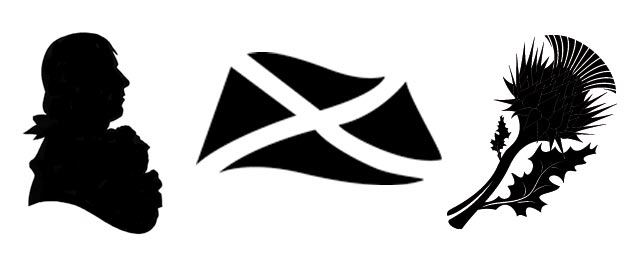
Spines are often overlooked when designing book covers, but usually they are the only part of the book you will see in a physical book store. I’ve branded the spines too, but differentiated them from each other by using coloured type for the titles and a tiny image – a bust of Burns, a Saltire and a thistle.
If you’d like to buy a copy of the books for yourself or a youngster who enjoys history, you can purchase copies from the Rowan Tree Publishing website.


