Pantone Colour of the Year 2016

Every year, Pantone select a ‘colour of the year’ that they deem to reflect the zeitgeist (buzzwords this year are balanced, calming, wellness, duality, tranquility).
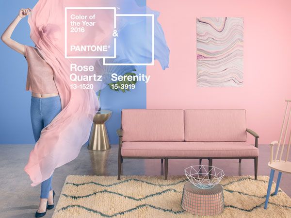
This year, they have for the first time introduced 2 shades: Rose Quartz (a dusty pink) and Serenity (a cool, soft blue). Already, these colours have crept into clothing and interiors – though not so much into graphic design; the profession is not quite so fashion-conscious (though does follow trends).
Does this really reflect what’s happening in the world? In the world of style, maybe, but not otherwise (if only it did). OK, there has been an increase in mindfulness, but conflict still rages worldwide. It may well reflect what people would like life to be like, though.
It’s a great piece of marketing, and there’s no doubt than colour can affect mood. Maybe in a small way this will contribute to a more peaceful world.
You can find out more on my Pantone 2016 Pinterest board. Happy viewing!
If you don’t really know which colours evoke certain feelings and would like to find out more, Pantone have a ‘colour of the day‘ on their website with a brief description of how that colour might make you feel.


