Millennials, you probably won’t have heard of Donovan, but in the sixties he was as cool as a cucumber. He was a singer-songwriter and guitarist who developed an eclectic and distinctive style that blended folk, jazz, pop, psychedelia, and world music (source Wikipedia). Donovan’s album covers were some of the first graphic images that made an impression on me as a young schoolgirl. They used very distinctive fonts which seemed to reflect his style of music. The most well known was ‘Arnold Bocklin’, used copiously in the sixties (in fact Arnold Bocklin was as ubiquitous as Comic Sans is today) but other similar fonts were used.


I’ve noticed that there has been a resurgence of this style, and I’ve started to snap instances of this. Here’s what I’ve found recently:
-

- A shop sign in Stirling
-

- Fascia of a bar in Cadiz.
-

- Spotted at the Wolgang Tilmans exhibition at Tate Modern.
-
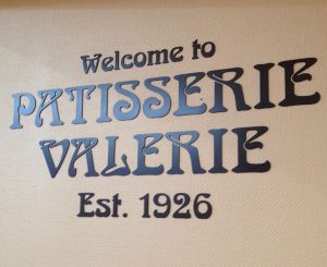
- Patisserie Valerie at a motorway service station.
-

- A fascia in Spitalfields market.
-

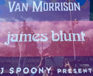
- A poster outside Olympia station.
-
- Kew The Music poster on Teddington station
-

- Pizza Express, Teddington.
-

- Part of a sign in a Reykjavik cafe.
I wonder if this is to become a trend? I blame Liam Gallagher who started this resurgence with his Pretty Green logo (which I love). What do you think of this style? Is it here to stay?
![]()
If you would like any advice on typography, please get in touch. In the meantime, find out how much you know about fonts by taking our quick quiz.
About the author
Annette Peppis leads the team at Peppis Designworks, a creative hub of established publishing industry experts who create books, branding, marketing material and design templates for leading publishers and businesses. Keep in touch by to her bi-monthly emails.


