Portuguese portrayals

I usually like to stay in London during the summer months and get away when it’s cold, but this year I broke with tradition and spent a couple of weeks in northern Portugal. Graphic designers never really switch off as we cannot help but notice typography and graphics, and I am no exception. How did the Portugese measure up?
The Quintas
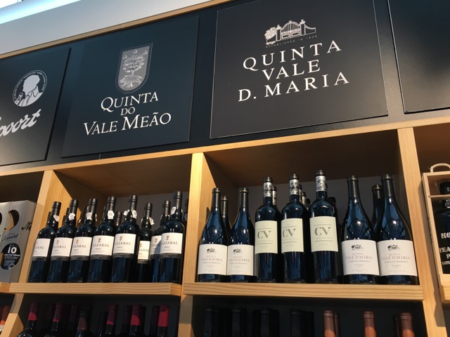
A Quinta is a wine estate producing both Port and regular wines. They are traditional establishments, often over 100 years old, with gracious buildings set within steeply terraced vineyards. Some offer upmarket accommodation, and their branding reflects their traditional values. Serif faces are usually used (serif letterforms have a small decorative line added to the end of a stroke as embellishment to the basic form of a character) which reflect this. Verdict: good.

Tourist office
Most tourist offices have an information logo, usually a white lower-case I in a blue circle, with nondescript type. This unusual fascia in Guimares, a Unesco World Heritage site, uses metal and very unusual letterforms. Not only are they beautiful, but they fit in perfectly with the medieval surroundings. Verdict: inspired.

Wine bar
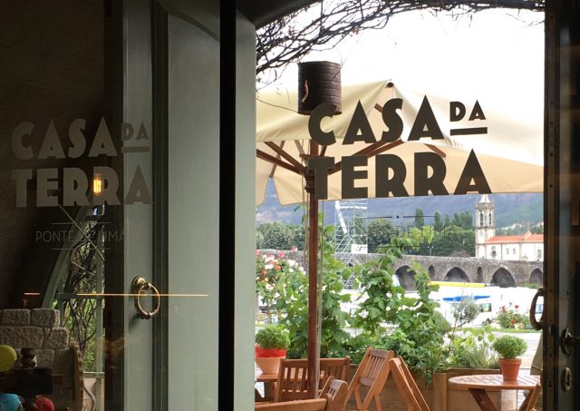
This lovely wine bar was a little oasis among a row of nondescript restaurants. The Art Deco inspired logo had a modern inviting feel, what else could I do but go in? Verdict: very good.

Hotel room numbering
Why use a little brass number when you can have an enormous funky graphic on your door? Verdict: excellent.

Tapas bar
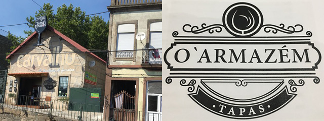
I spied this tapas bar across the railway tracks and had to investigate. The sign at the top ‘did what it said on the tin’ and advertised the tapas and wine on sale there, but also hinted that the interior had both a traditional and designer feel. The menu logo was different but in the same style, so good branding. Verdict: very well done.

Bakery
This bakery in Porto was recommended to me and it must be one of the best in the country. However, had it not, I don’t think it’s signage would have attracted me. Verdict: could do better.

Loo signs
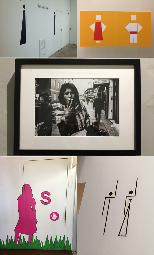
What can I say? The inventive Portugese have put us to shame! Here are some examples of some of the best ones that I saw. I particularly like the ‘smoking woman example – both loo doors were unmarked, and you could only find out which one was yours by opening the door and seeing the framed picture.

What graphics have caught your attention when you’ve been away? I’d love to know.


