Do you ever feel like having a spring clean, a de-clutter and a brightening up of your home or your image? I know I do. One of the best ways of doing this is through colour. But how do you choose colours that match?
I’ve been lucky enough to learn about colour; during my A level Art qualification, my degree course and throughout my career. But what if you don’t know anything about colour theory or colour psychology? Fear not, help is at hand. There’s a great free resource to help you: the Adobe Kuler colour wheel. There are several ways to use this.
Method 1: matching a colour you like
When you click through to the colour wheel, you’ll see something like this:

Click on the middle circle (with a bold white outline) and move it around until you get to your favourite colour. The further into the centre of the circle you go, the paler your base colour will be, so if you like strong colours, drag the circle to the outside. I decided to use a bright orange which I chose by dragging the circle to the top right of the colour wheel (about 1 o’clock). I could have also typed in the CMYK values or the hexadecimal code number (only recommended for design techies), In the box on the left, I selected ‘Analogous’, which means colours that are close to each other. The palette looked like this.

Next, I tried Monochromatic, which showed shades (darker) and tints (paler) of the same or similar colours. This is good for making a harmonious scheme, and if you want to match colours in your branding.

After that, I tried Triad, which chooses colours 120 degrees from each other. You can get some very unusual combinations here that you wouldn’t normally try:

My fourth experiment was with complimentary colours – colours that are opposite each other on the colour wheel. I really like complimentary colours and use them a lot – they can be very vibrant. Not everyone’s cup of tea, though:

Next I tried compound colours. I’ve no idea what this algorithm is based on! All the colours are in the same half of the spectrum and of differing shades and tones. I’m not quite so keen on these:

Finally, I clicked on shades, which are the same colour but mixed with varying degrees of black. The results can be quite sombre, but will suit some moods:

Method 2: matching the colours of a photo
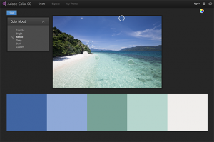
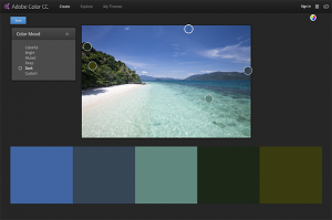
At the top right of the screen, you will see a little camera icon. Click this, and it will prompt you to upload a picture (in jpg format) from your device. It will then sample 5 colours from your image and give you the option of colourful, bright, muted, deep or dark colours. Try it! This feature would be especially useful if you were creating social media graphics based on an image.

You can check out the colour wheel here
If you don’t want to use the Adobe tool, there are a number of alternatives: Paletton, which has a standard colour wheel, Colours, which will generate a scheme for you and Colormind, which can suggest different shades for separate areas of your design.
Now I’m going to let you into a secret
A few years ago, I used to work on a BBC Good Food cookery book series. The basic design for the whole series was the same, but each new book had a new title, a new picture and a new colour scheme. I used to have to supply several colour schemes each time I designed a new cover. For one of the books, I submitted 5 of my own schemes and 5 Adobe Kuler ones. Guess which ones got shortlisted? Surprisingly, they were all my own. So, although these tools are great, you can always improve on them!
About the author
Annette Peppis leads the team at Peppis Designworks, a creative hub of established publishing industry experts who create books, branding, marketing material and design templates for leading publishers and businesses. Keep in touch by subscribing to her bi-monthly emails.


