Did you know that red and green are complimentary colours? Whoever said ‘red and green should never be seen’ got it wrong!

Complimentary colours
Complimentary colours (on opposite sides of the colour wheel) create vibrant and dynamic colour combinations.
Can you guess why I used red and green for this logo? The clue is in the name … of course, they are the colours of the Italian flag, and that’s why 2 of the 3 design concepts I presented to my client contained various shades of red and green. I didn’t get it right first time, though. My first stab at the design looked like this:

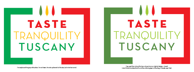
Did you spot the mistake? I’d inadvertently switched the colours, but that aside, it didn’t quite hit the mark. I didn’t want to detract from the flag colours so used a quiet grey for ‘tranquility’ – but the general effect was a little bit too restrained for my liking. My client agreed, and asked me to add some pictorial elements to liven it up. This is what I came up with. As you can see, I stuck to using red and green.
An alternative layout
In the course of my design explorations an alternative layout also presented itself – it’s very useful to have a logo alternative which is a different shape.

In the last 2 examples I introduced a dark olive green and a bright lime green to reflect the olives and citrus fruits that grow in Tuscany. My client liked the design with the smooth cedar trees and asked me if I could incorporate yellow and/or olive green into the next step of the design. Neither of us liked the yellow, but replacing the very strong green of the flag with a subtle olive green was a big hit. The company is exclusive and up-market, and the final colours reflect that.

All that was left to do was to switch the order of the trees so that the red tree (representing taste) sat on the left of the trio, and the olive tree (representing Tuscany) sat on the right.
The website
At the moment I am working on the Taste Tranquility Tuscany website (which is predominantly green with red accents) – I can’t wait until it launches later this year. I’ve got to know a lot about this company over the past few months, and I’m impressed; they will be providing sophisticated ‘eating holidays in Tuscany’ later this year once the builders have finished upgrading the villa. Good company, great food and wine, sunshine, lovely scenery and walks – what more could you ask for?
Look at ‘Taste-Tranquility-Tuscany.com’ from Autumn 202 onwards and see if you can resist!
About the author
Annette Peppis leads the team at Peppis Designworks, a creative hub of established publishing industry experts who create books, branding, marketing material and design templates for leading publishers and businesses. Keep in touch by to her bi-monthly emails.


