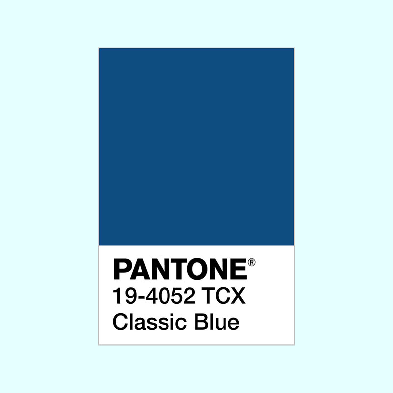
Pantone have announced that their Colour of the Year 2020 is Classic Blue. It’s a fabulous colour to wear, and also a good ’neutral’ for designers. It may look a little staid on its own, but with an accent colour of bright orange (its complimentary colour), lime green or hot pink it can look sensational.

If you prefer a more muted colour scheme, you could use it with other blues and greens of a similar tone, as shown below. Pantone also suggest some colour combinations on their website.

The effects of blue on mood
Pantone says ‘Instilling calm, confidence, and connection, this enduring blue hue highlights our desire for a dependable and stable foundation on which to build as we cross the threshold into a new era.’ Politics in the UK and the world has been so volatile, as have environmental catastrophes, that an injection of calm (which many blues provide) is a welcome antidote.
How does Pantone decide which colour to choose?
By analysing trends thoroughly. These could be colours used by new artists, in fashion, on film, and by the the design industries in general. Social media, new technologies, materials, textures and effects are also taken into account. Different colours are popular In different countries, and also have different meaning depending on the nationality of the viewer, so this is also considered.
Pantone collaborates with businesses and brands to advise them on colour, so you can be sure that we’ll see Classic Blue everywhere in 2020.
Shutterstock’s colour forecast
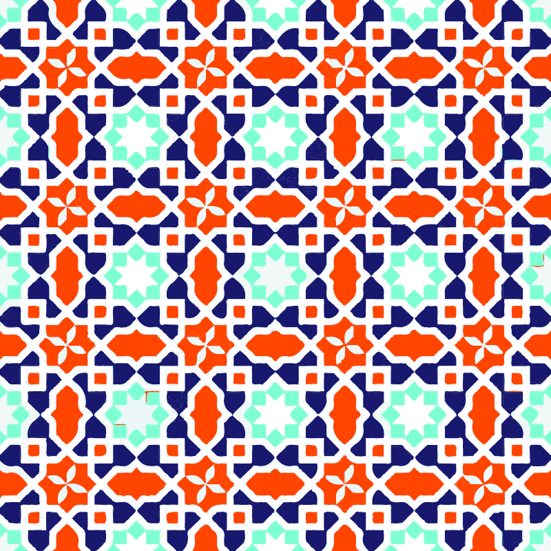
The photo library Shutterstock has also released their colour forecast for the year. To do this, they analysed the pixels of the images their customers were downloading most frequently, then worked out which colours had the greatest growth. Three colours topped the bill: Lush Lava (an orangey red), Aqua Menthe (peppermint green) and Phantom Blue – a deep indigo not dissimilar to Pantone’s top colour. I’ve incorporated these colours into the graphic below.

The UK’s favourite colour was a dark but bright intense blue, and most countries’ favoured strong intense colours rather than tints and pastels.
Whether you like the forecasters’ favourites or prefer pastels, Pantone is very influential, and there’s no doubt we’’l be seeing more Classic Blue in the shops, interiors and online.
To read more of my articles about colour, choose from the Colour category.
About the author
Annette Peppis leads the team at Peppis Designworks, a creative hub of established publishing industry experts who create books, branding, marketing material and design templates for leading publishers and businesses. Keep in touch by to Annette’s bi-monthly emails.


