Although it’s perfectly possible to create a design using just one typeface (see the example at the end of this article) most designers choose to use two typefaces in their designs. This is called font pairing. In this article I’ll give you some tips on how to mix and match fonts, showing examples of headings, subheadings and text that go well together.
Combining traditional serif and sans serif typefaces
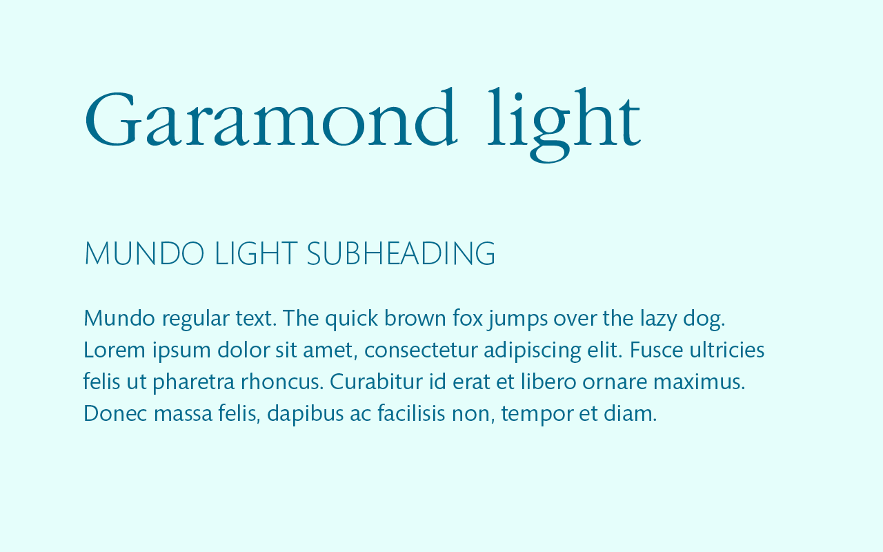
Don’t know the difference? A serif is a decorative stroke (or foot) that finishes off a letter. ’Sans’ means without, so a sans serif typeface does not have these. Here, I’ve combined Garamond and Mundo. You’ll be able to see the little flicks (serifs) on the Garamond font quite clearly. I’ve combined it with Mundo, a sans serif I really like which also comes in lots of weights.

In the next example I’ve switched and used a sans-serif (Futura Light) for the heading and a serif typeface (Bembo semibold) for the text.

Combining slab serif and sans serif typefaces
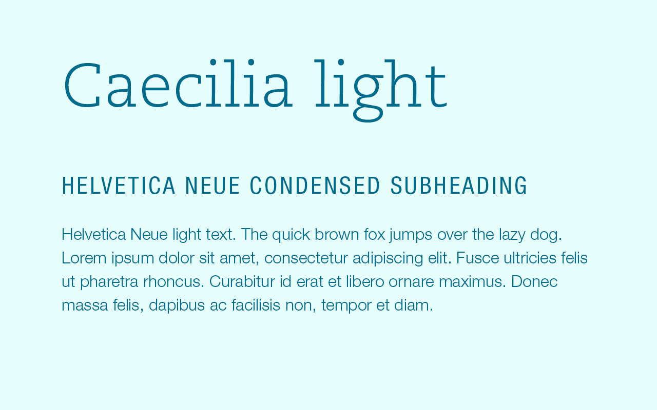
A slab serif, sometimes called Egyptian, is a serif typeface where the serifs are ‘blocky’ rather than elegant. Here I have paired the slab serif PMN Caecilia with the sans serif Helvetica Neue. I’ve used the Condensed version of the font for the subheading, widely spaced – I really like the contrast between that and the heading, and the Light weight for the body text.
Personally, I’m not keen on slab serifs for body text, so I haven’t shown an example of this.

Combining scripts with serifs
Shelley Allegra is a very elegant typeface so must pair with an elegant text face. Below I have combined it with Baskerville.

Combining scripts with sans serifs
Wendy is a fun, informal style of font and looks good paired with a no-nonsense sans serif. Univers fits the bill.

Combining a serif and sans serif version of the same typeface
If you’re unsure which typefaces match, this is a no-brainer. Many font families have a serif and serif version which have been designed to go well together. Experiment with sizes and weights to find a pleasing combination. I’ve used Stone Sans Medium for both the headings and the subheadings, and Stone Serif for the body text.

Combining a decorative headline typeface with a simple text face
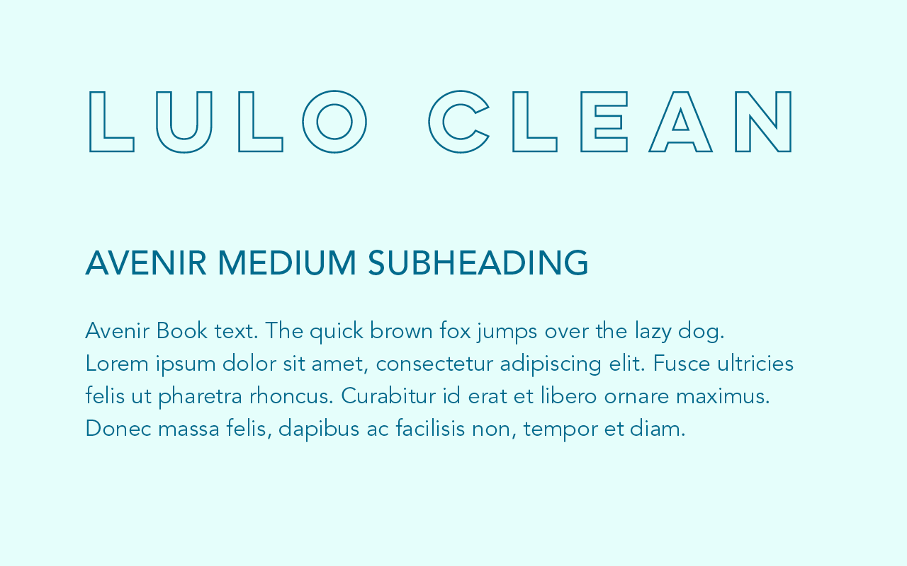
Opposites attract. Bear this in mind when pairing decorative typefaces with text faces. In this example I have used Lulo Clean for the heading – it’s an outline, squarish in shape and very widely spaced. It’s paired with Avenir, a nicely rounded sans serif which contrasts well.

Using different weights, sizes and colours of just one typeface
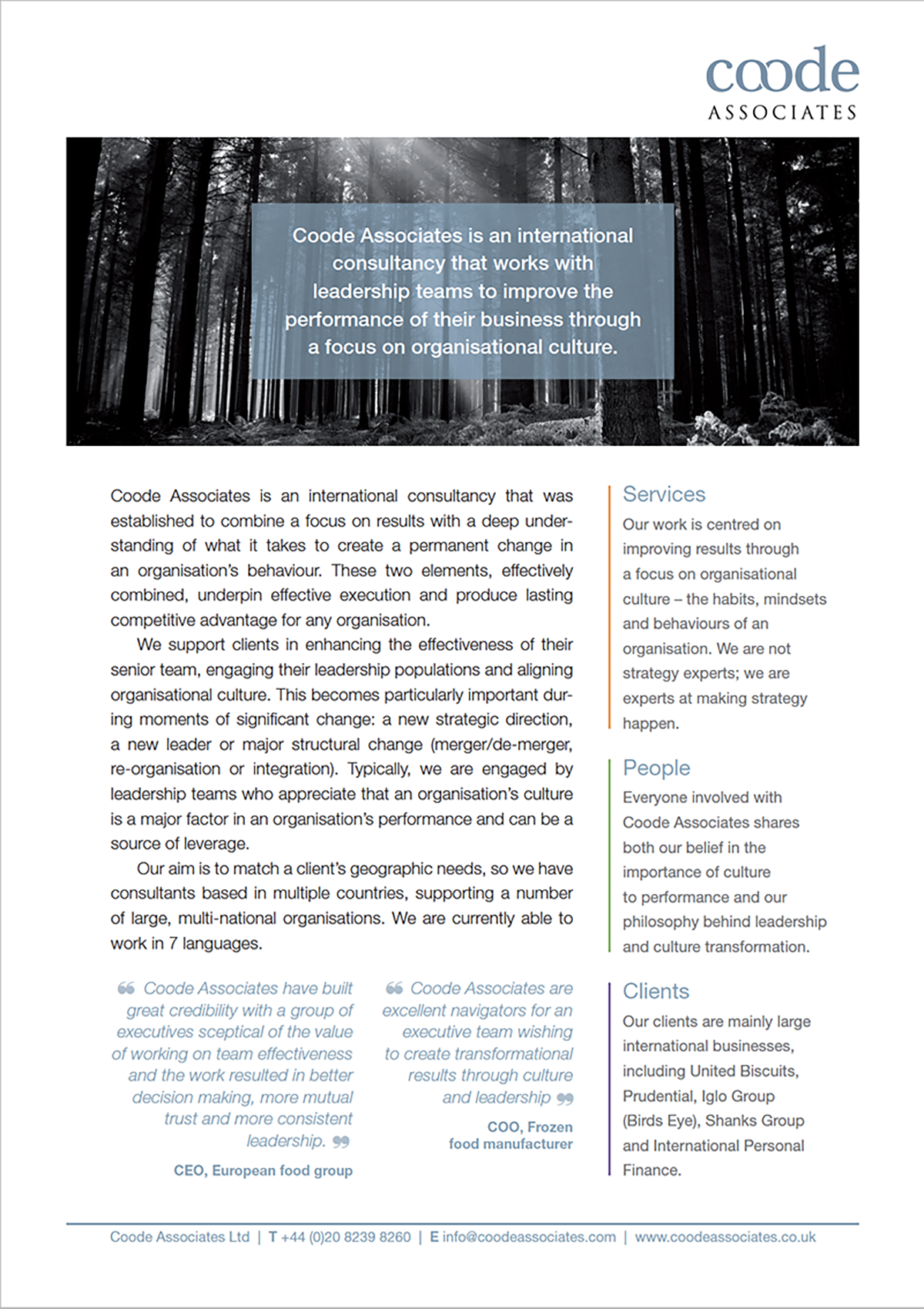
I often use a single typeface for an entire design, whether it’s a book or a piece of marketing material. Choose one that has many styles and weights and you can’t go wrong. This information sheet id designed using a single typeface, Helvetica, but using different sizes, weights, styles and tints give it life.

Finding fonts you like
We all have our favourites, and I’ve used some of mine in this article. If you like any of them and would like to find a similar free alternative, you can use identifont to find one.
Check out Dafont for free fonts. Font Squirrel and Google Fonts also have a good selection – but be careful, there are ugly ones there too.
If you enjoyed this article …
You might also like ‘How to choose colours that match‘.
About the author
Annette Peppis leads the team at Peppis Designworks, a creative hub of established publishing industry experts who create books, branding, marketing material and design templates for leading publishers and businesses. Keep in touch by to her bi-monthly emails.


