Is it red or is it pink?
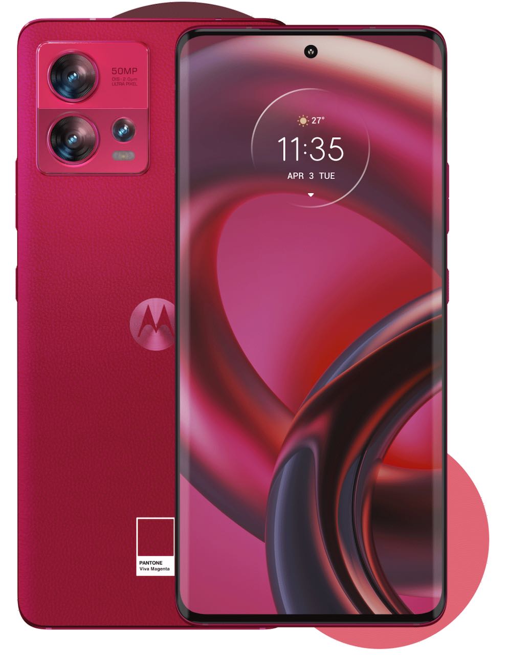
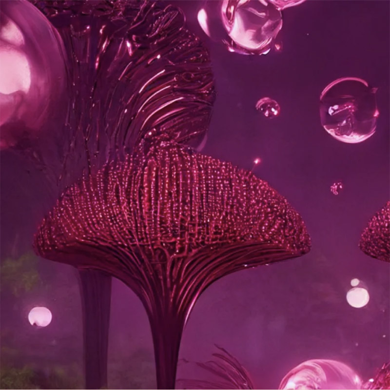
Pantone has announced its colour of the year for 2023 and it’s Viva Magenta. They describe it as “a new animated red that revels in pure joy”. It looks pink to me, Pantone. At least, that’s what I perceive. The Cambridge English Dictionary describes magenta as “a reddish-purple colour, one of the main colours that are used in colour printing and photography”. What’s your opinion?
Colour perception
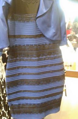
Colour is very personal and we all see and respond to colours differently. Pantone caused a stir by describing last year’s colour, Veri Peri, as blue (I think it’s a shade of purple). Do you remember the white and gold or blue and black dress from 2015? That also got people talking, so it’s a great marketing ploy.

How is the Pantone colour of the year chosen?
When choosing the colour of the year, fashion forecasters at Pantone try to capture the mood of the moment. They draw on influences seen in art, films, fashion, technology and social media, as well as world events. I think they’ve done this quite well, as their description of what’s going on in the world is pretty accurate.
“Viva Magenta offers us the assurance and motivation we need to weather long-term disruptive events. Three years deep into a pandemic, facing a war, an unstable economy, social unrest, supply chain breakdowns, and mounting climate change, we need to heal. And still, we need to find the motivation to continue. Here, Viva Magenta cloaks us in both power and grace, and sends us out into the world with the verve we’ve yearned for.”
It’s profitable
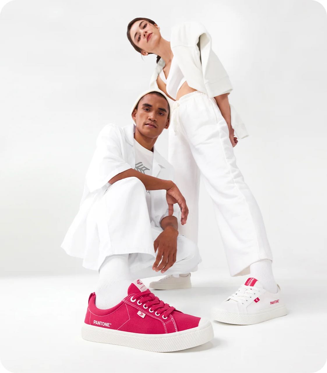
There’s another side to the Pantone Colour of the Year: making money. Pantone licence the colour to big companies so that they exclusively can use Viva Magenta on their phones, trainers, wallpaper, etc. it’s also a useful sales tool for other retailers – everyone wants to be in vogue after all.


Would I use it I’m my design work? Yes, in moderation. In my home? Maybe, as an accent colour. Wear it? For sure.
If you’d like to find out more about Viva Magenta you can do so on the Pantone site, but be warned; the language is very flowery and pretentious.
https://www.pantone.com/articles/color-of-the-year/what-is-viva-magenta
If you’d like to find out more about pink, Karen Haller has written an interesting article about women reclaiming their relationship with pink,
https://karenhaller.com/journal/why-women-need-to-reclaim-their-relationship-with-pink/
and another on how boys can like pink.
https://karenhaller.com/journal/boys-can-like-pink-too/
Visit this link to see past Pantone colours of the year.
About the author
Annette Peppis leads the team at Peppis Designworks, a creative hub of established publishing industry experts who create books, branding, marketing material and design templates for leading publishers and businesses. Keep in touch by to her bi-monthly emails.


