
The Pantone Color of the Year competition has taken place since 1999, and has become quite an event. This year’s winner is Pantone Peach Fuzz.
Leatrice Eiseman, the Executive Director of Pantone says: ‘Pantone Peach Fuzz captures our desire to nurture ourselves and others. It’s a velvety gentle peach tone whose all-embracing spirit enriches mind, body, and soul.
In seeking a hue that echoes our innate yearning for closeness and connection, we chose a colour radiant with warmth and modern elegance. A shade that resonates with compassion, offers a tactile embrace, and effortlessly bridges the youthful with the timeless.’
I believe such a soft an inoffensive colour may well have been chosen as a backlash against all that’s happening in the world at the moment. (War, violence, climate change, and the rise of the extreme right signify the colours black and red to me.)

How is Pantone Color of the Year chosen?
Not by a group of influencers getting together one afternoon and thrashing it out. Pantone don’t only look at what design studios have produced over the past year, but also at film, fashion, art and culture. They aim to chose a colour that is on the rise globally, not just in the USA.
The award has a knock-on effect. ‘We do see that colours we select to be our Pantone Color of the Year increase in popularity, and once integrated into the cultural mindset, become even more influential the following year.’
Palettes
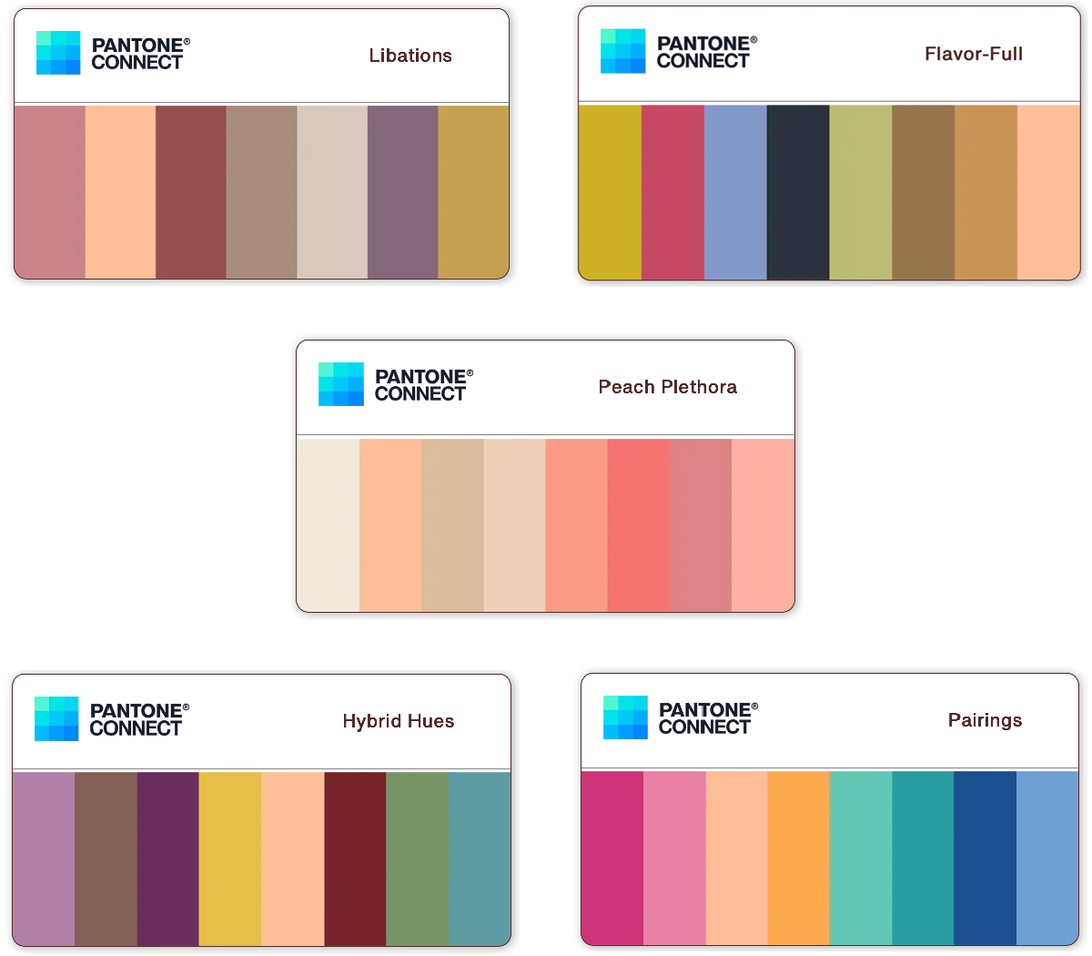
Pantone have suggested five palettes of colours to use with Pantone Peach Fuzz, but only the analogous one (with similar colours) hits the spot for me. What are your thoughts?
Products
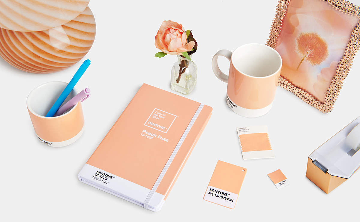
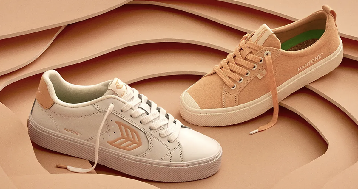
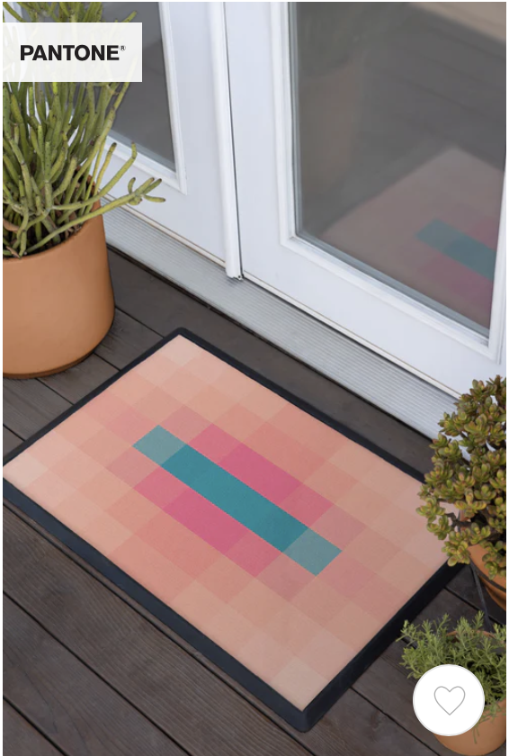
Already, Pantone’s partners and collaborators have brought out Pantone Peach Fuzz products as diverse as rugs, textiles, trainers, make-up, even tea. I really like Spoonflower’s wallpapers and fabrics which seem to be based on the analogous palette but I’m not so keen on the Pantone Peach Fuzz Pop Prism doormat price tag ($179). You may think that Pantone Color of the Year is just a bit of fun, but it will no doubt cause many of us to part with our hard-earned cash.

Free downloads
You can enjoy Pantone Peach Fuzz by downloading five digital wallpapers here.
Would I use it?
Probably not. I don’t think I follow trends, and it certainly wouldn’t be right for any of my current clients.
Dulux Colour of the Year (UK)
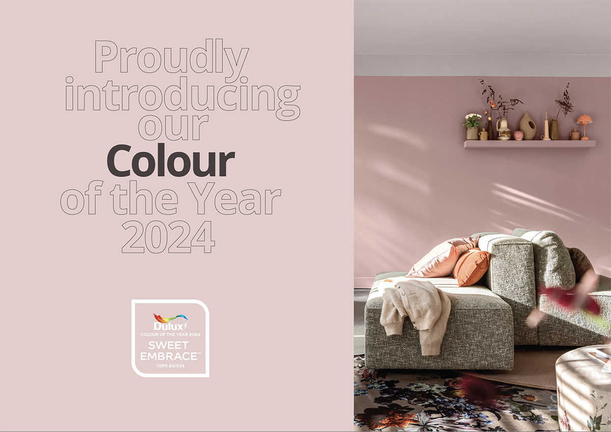
This is Sweet Embrace, a soft, muted pink. I’d put it in the same ballpark as Pantone Peach Fuzz, pastel and calming, but unlike the peach (which to me looks rather retro) Sweet Embrace is bang up to date. I would much rather have this colour in my wardrobe and in my home.
Dulux have created three palettes to use with Sweet Embrace: a warm palette, a calm palette and an uplifting palette. You can download their brochure to see how best to combine their 2024 colours.

If you’d like to find out more about Pantone Peach Fuzz you can do so on the Pantone site.
Visit this link to see past Pantone colours of the year.
About the author
Annette Peppis leads the team at Peppis Designworks, a creative hub of established publishing industry experts who create books, branding, marketing material and design templates for leading publishers and businesses. Keep in touch by to her bi-monthly emails.


