Brush Script – a thing of beauty to the untrained eye?

 I’ve recently returned from South East Asia where I was delighted by the Khmer and Chinese lettering. To me, the scripts looked beautiful and elegant – even this school poster is charming. To a Cambodian designer though, this may be the epitome of bad taste. It’s difficult to know how images will be perceived by another culture, and something I saw whilst in Phnom Penh illustrated this quite well.
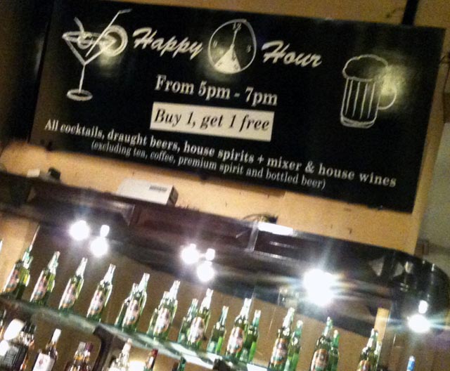
The Foreign Correspondents Club is a smart venue right in the centre of the city. It’s no longer used by journalists, but is a must-see for tourists, as it has retained its original architecture (and charm). I was surprised to see that they had used Brush Script for their Happy Hour sign – to me Brush Script is not only downmarket but downright nasty! Perhaps my Cambodian counterpart is wistfully admiring it! This just goes to show that for a design to succeed you have to know and understand your target market and its culture.
Thanks to Dragfyre for the use of the photo of Cambodian script.


